
Last Updated on February 14, 2022 – 4 min read
In this article, you will discover to implement an interactive data visualization on a map.
To start, you need to install the packages Pandas for DataFrame processing and Folium for maps creation.
What is Folium? Folium is a Python library for visualizing geospatial data. Folium is a Python wrapper for Leafleft.js, an open-source Javascript library used for an interactive map. Plotting interactive maps with Folium is easy.
Make sure that Pandas and Folium libraries are installed on your machine. You can use the pip install command in your terminal to install packages.

How do you create an interactive map with Python?
This article is divided into 3 parts :
- Input data loading and pre-processing
- Creation of a map with few markers
- Construction of the dynamic data in the time
Loading Data
As seen in the DataFrame – Input & Output article, you can import your Excel database with the read_excel function of pandas.
Here, we load a database of the Airport Traffic in the USA impacted by Covid 19 during 2020. Data comes from the Kaggle site. You can quickly visualize this DataFrame.
import pandas as pd

# initialisation input file data  xlsx
path_file_database = "/Users/Name/Documents/Python/Data_viz/covid_impact_on_airport_traffic.xlsx"
df_data = pd.read_excel(path_file_database, "DATA", index_col=None)

# keep only useful columns
df_data = df_data[["AirportName", "Latitude", "Longitude", "Date", "PercentOfBaseline"]]
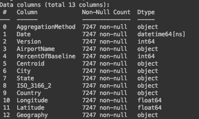
This DataFrame contains 13 columns and 7 248 rows.
You can do some pre-processing on the DataFrame.
Before plotting your map, bring data into a good format. You will need a column for Latitude and Longitude in decimal format. Convert these columns as floats.
It is important to check the quality of data as NaN or null values.
To avoid any issues, convert the Date column format.
# pre processing data
df_data["Latitude"] = df_data["Latitude"].astype(float)
df_data["Longitude"] = df_data["Longitude"].astype(float)
df_data["Date"] = df_data["Date"].dt.strftime("%d/%m/%y")
df_data["PercentOfBaseline"] = df_data["PercentOfBaseline"] / 100  # create a weight
Now, you can create a map using the Folium package.
Create Map
You can configure the zoom start and the title on the map. Several choices are possible for tiles as OpenStreetMap or CartoDB Positron. Our map will be centered at the mean latitude and mean longitude.
You can consult the following link for more details about Map arguments.
# initialisation of a new map
map_draw = folium.Map(location=[df_data.Latitude.mean(), df_data.Longitude.mean()],
                      zoom_start=3, control_scale=True, tiles="CartoDB positron")
You can add marker location. Marker corresponds to items used for marking locations on a map. Call the Folium Marker class with the location of your marker, a description, and an icon. These markers are based on the latitude and longitude data.
# add the marker of a new map
for index, location_info in df_data.iterrows():
    folium.Marker([location_info["Latitude"], location_info["Longitude"]],
                  popup=str(location_info["AirportName"]),
                  icon=folium.Icon(color="darkblue", icon_color="#FFFFF", icon="cloud", prefix="fa")).add_to(map_draw)
Interactive Map with Python
The interactive part starts here. How to draw dynamic data on the map?
You will need to use a Folium plugin. It exists several Folium plugins such as AntPath, MeasureControl, and Draw.
import folium
from folium.plugins import MeasureControl
from folium import plugins
To use the HeatMapWithTime class you need a list of data with the latitude, longitude, and weight of each point. It will be a list of lists, with each inside list at a similar date.
To construct this list, you can use the following loop on the DataFrame Groupby date :
# draw dynamic HeatMap in time, based on a list comprehension to make out list of list
list_heat_data = []
for _, d in df_data.groupby("Date"):
    list_heat_data.append([[row["Latitude"], row["Longitude"], row["PercentOfBaseline"]] for _, row in d.iterrows()])
You now have the list of data to use the HeatMapWithTime function. You can use your map to add information through the index.
# draw the list of data for the index in the map
list_date = list(df_data["Date"].unique())

heatmap_data_time = plugins.HeatMapWithTime(data=list_heat_data, auto_play=True, max_opacity=0.8, radius = 20, speed_step=1, display_index=True, min_speed=5, index=list_date)

heatmap_data_time.add_to(map_draw)
You can save your map in HTML by using the save function. Open your HTML file in a browser. It opens a web page with your map, markers, and dynamic data.
# add the plugin measurement
map_draw.add_child(MeasureControl())

name_output_file = "HeatMap_time_airport.html"
map_draw.save(name_output_file)
You now have all elements to understand Folium and create your interactive maps.
Below are all the codes:
import pandas as pd
import folium
from folium.plugins import MeasureControl
from folium import plugins

# initialisation input file data  xlsx
path_file_database = "/Users/Name/Documents/Python/Data_viz/covid_impact_on_airport_traffic.xlsx"
df_data = pd.read_excel(path_file_database, "DATA", index_col=None)

# keep only useful columns
df_data = df_data[["AirportName", "Latitude", "Longitude", "Date", "PercentOfBaseline"]]

# pre processing data
df_data["Latitude"] = df_data["Latitude"].astype(float)
df_data["Longitude"] = df_data["Longitude"].astype(float)
df_data["Date"] = df_data["Date"].dt.strftime("%d/%m/%y")
df_data["PercentOfBaseline"] = df_data["PercentOfBaseline"] / 100  # create a weight

# initialisation of a new map
map_draw = folium.Map(location=[df_data.Latitude.mean(), df_data.Longitude.mean()],
                      zoom_start=3, control_scale=True, tiles="CartoDB positron")

# draw dynamic HeatMap in time, based on a list comprehension to make out list of list
list_heat_data = []
for _, d in df_data.groupby("Date"):
    list_heat_data.append([[row["Latitude"], row["Longitude"], row["PercentOfBaseline"]] for _, row in d.iterrows()])

# draw the list of data for the index in the map
list_date = list(df_data["Date"].unique())

heatmap_data_time = plugins.HeatMapWithTime(data=list_heat_data, auto_play=True, max_opacity=0.8, radius = 20,
                                            speed_step=1, display_index=True, min_speed=5, index=list_date)

heatmap_data_time.add_to(map_draw)

# add the plugin measurement
map_draw.add_child(MeasureControl())

name_output_file = "HeatMap_time_airport.html"
map_draw.save(name_output_file)
